1
2
3
4
5
6
7
8


Can Shrink and Pattern Design
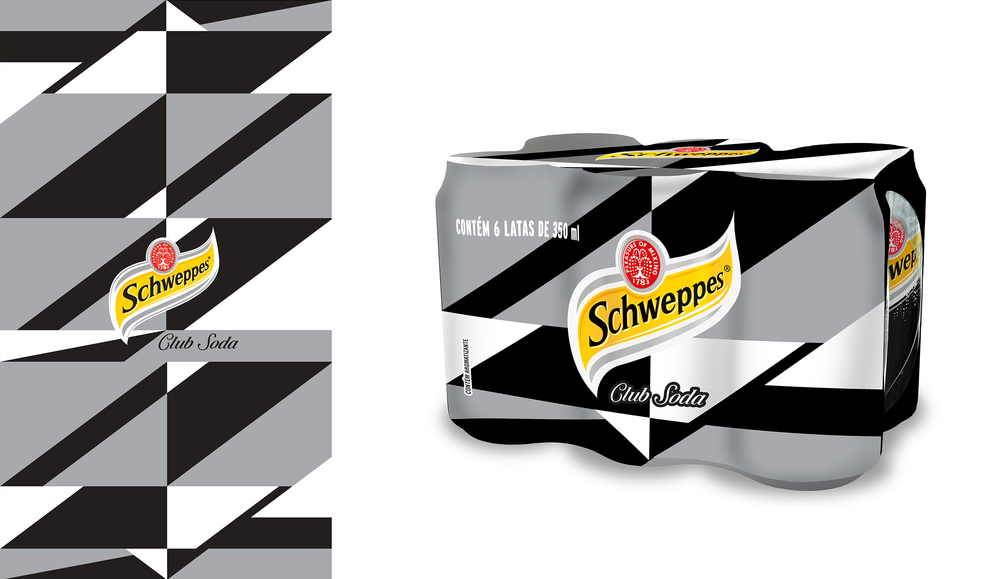
We were invited to create new and refreshing patterns for the Can Shrink design for all the flavours of the Schweppes family in Brazil. The target was to bring sophistication, keeping the DNA of Schweppes.
We worked on 2 main ideas, that ended up both being chosen for production. My first idea was based on vintage recipes of drinks that had an almost scientific approach to the ingredients and the mixes. So for each flavour, fine lined icons were crafted to represent mixes that could be done with the particular flavour in question.
And for the second idea, a geometric grid was created from the main angle of the Schweppes logo, and outspreaded into a impactful graphic pattern.
Team: Carol Peixoto, Eduarda Paternot and Pablo Uga
My Role: Creative Coordinator
| Project done for Cravo Ofício
Fev - May 2015 |